
Crypto markets are famously volatile, but beneath the price swings lie patterns that can hint at an upcoming crypto bull run. Recognizing these signals early allows traders and investors to position themselves before momentum picks up.
This article breaks down 10 key indicators that signal a potential crypto rally. They fall into two categories:
• On-chain data, such as network activity and wallet behavior, reveals how capital is moving in the market.
• Technical indicators and chart patterns, including moving average crossovers and volume breakouts, that highlight shifts in price momentum.
By combining these perspectives, you will have a comprehensive view of how to identify when the market may be gearing up for a rally. We will also explore historical examples, such as the MVRV Z-Score’s increase in 2020–2021 during Bitcoin’s climb to over $60,000 and how technical indicators, such as RSI divergences and Golden Crosses, supported the trend.
Whether you’re an active crypto trader or a long-term investor, these indicators provide actionable insights to navigate the crypto market’s dynamic landscape.
1. MVRV Z-Score and Realized Value
The Market Value to Realized Value (MVRV) Z-Score is a vital on-chain analysis tool that helps investors assess whether Bitcoin is overvalued or undervalued relative to its historical norms.
Understanding MVRV Z-Score:
• Market Value (MV): This represents Bitcoin's current market capitalization, calculated by multiplying the current price by the total circulating supply.
• Realized Value (RV): Unlike MV, RV considers the price at which each Bitcoin last moved on-chain, offering a more grounded view of the network's valuation by reflecting the average cost basis of all coins.
• MVRV Z-Score: The Z-Score tells us how far apart these numbers are. When the market value is much higher than the realized value, it means Bitcoin might be overpriced, and a pullback or correction could happen. When the Z-Score is low (market value close to or below realized value), it suggests Bitcoin might be undervalued, a potential buy signal.
How to Interpret the MVRV Z-Score:
• High Z-Score (>7): Indicates that Bitcoin's market value is significantly higher than its realized value, suggesting an overbought market and potential for a price correction.
• Low Z-Score (<0): Suggests that Bitcoin's market value is below its realized value, indicating an oversold market and potential buying opportunities.
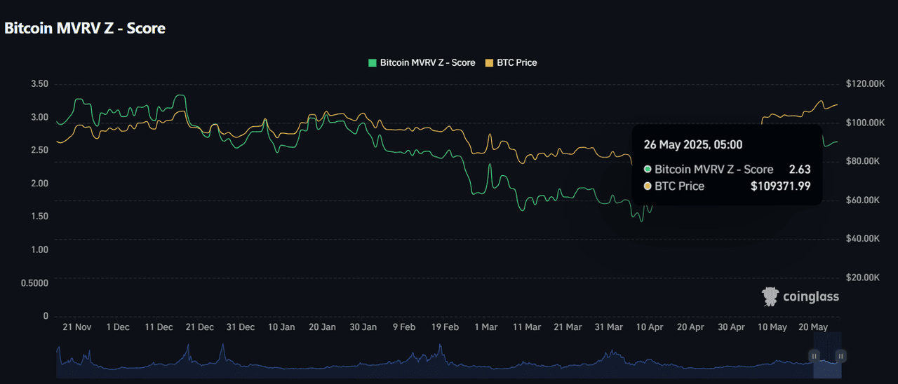
Bitcoin MVRV Z - Score | Source: Coinglass
The chart from Coinglass shows that on 26 May 2025, Bitcoin’s MVRV Z-Score was 2.63, and the BTC price was $109,372. This reading falls within a neutral range, meaning Bitcoin wasn’t heavily overvalued or undervalued. It signaled a stable market with balanced speculative behavior.
When the MVRV Z-Score climbs steadily from lower levels (like from <0 to around 3–4), it often signals growing market confidence and increasing demand. This shift can be an early indicator of a potential crypto bull run, as more investors recognize undervaluation and start buying, driving prices higher.
2. Crypto Futures Open Interest and ETFs
The cryptocurrency market is experiencing a surge in institutional interest, as reflected in rising futures open interest and growing ETF inflows. These two factors provide valuable insights into the overall market trend for digital assets.
What Is Crypto Futures Open Interest?
Open interest refers to the total number of active futures contracts across the cryptocurrency market, including Bitcoin, Ethereum, and altcoins such as Solana and XRP. An increase in open interest signals that more traders and institutions are entering the market, expressing confidence in future price movements.
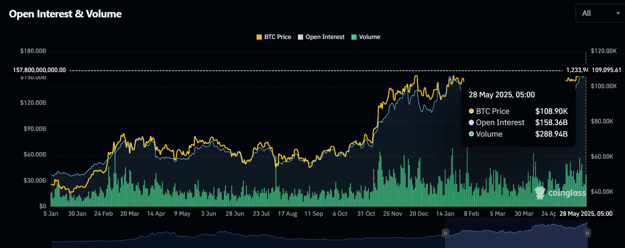
Bitcoin Open Interest & Volume | Source: Coinglass
As of May 2025, crypto futures open interest across major exchanges has climbed past $158 billion, a notable increase compared to earlier months. This growth highlights rising participation and speculative activity in the market.
How Do Futures Contracts Impact the Market?
Futures contracts allow traders to speculate on the future prices of crypto assets without directly owning them. When open interest rises, it indicates more traders are placing bets, either bullish or bearish, which can amplify price movements.
For instance, if many traders go long, expecting prices to rise, a strong upward move can occur. However, if prices unexpectedly fall, leveraged positions may face liquidations, increasing market volatility.
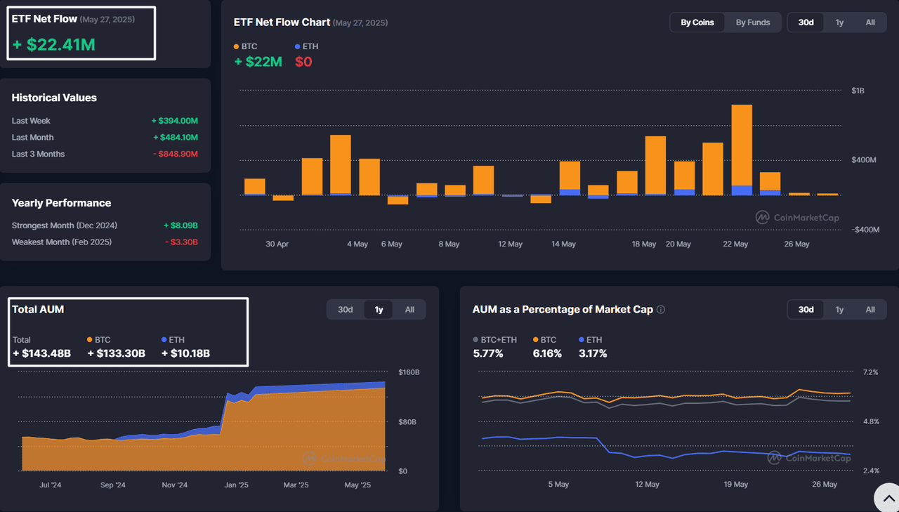
Inflows and Outflows of Bitcoin and Crypto ETFs
Since the U.S. SEC approved the Bitcoin ETF in January 2024, crypto ETFs have offered investors a regulated and accessible way to gain exposure to digital assets, and they have become a key metric for tracking market movements. Rising inflows signal growing investor confidence and demand, often indicating a bullish market trend. In contrast, large outflows during market dips may indicate heightened risk aversion, potentially signaling bearish sentiment. According to data from CoinMarketCap:
• Total AUM (May 2025): $143.48 billion, with $133.30 billion in BTC and $10.18 billion in ETH.
• AUM as Percentage of Market Cap: BTC 6.16%, ETH 3.17%, Total Crypto (BTC+ETH) 5.77%.
• ETF Net Flows (May 27, 2025): +$22.41 million (all BTC), reflecting continued inflows.
• Strongest Month (Dec 2024): +$8.09 billion; Weakest Month (Feb 2025): -$3.30 billion.
These inflows highlight increasing institutional confidence and growing market depth, suggesting a bullish outlook.
Bitcoin MVRV Z - Score | Source: Coinglass
For instance, consider a pension fund seeking to gain exposure to cryptocurrency. Instead of directly buying and storing coins, they invest in a diversified crypto ETF. As demand for these products grows, more capital flows into the market, driving prices higher.
At the same time, traders anticipating this trend increase their futures positions, further boosting open interest and signaling a bullish market phase.
Using On-Chain Metrics to Predict Market Trends
Key metrics, Open Interest, Volume, AUM, and ETF Net Flows, offer actionable insights into market sentiment.
1. Open Interest & Volume - Gauging Participation
• Open Interest: Tracks total futures contracts; rising levels suggest increasing participation and speculation.
• Volume: Measures total asset trade value; high volume validates price movements.
Insight: The rising open interest and volume, alongside price gains, suggest a bullish trend. Whereas, high open interest with falling prices may indicate excessive leverage and potential corrections.
2. AUM - Tracking Institutional Commitment
• AUM reflects total funds in ETFs; a rising trend indicates growing institutional involvement.
• AUM as a percentage of market cap highlights the share of total assets held by ETFs, indicating long-term support.
Insight: Rising AUM and AUM% % confirm strong institutional backing for digital assets.
3. ETF Net Flows - Tracking New Investments
• ETF Net Flows measure daily fund inflows/outflows into ETFs.
• Positive flows signal rising confidence and fresh capital, while negative flows suggest caution.
Insight: Sustained positive flows often precede market uptrends, as evidenced by the CoinMarketCap data, which shows consistent net inflows for BTC ETFs in May 2025.
3. Whale Accumulation and Large Wallet Growth
One of the most evident signs of an upcoming crypto bull run is the quiet accumulation of assets by whales, large holders controlling thousands of Bitcoins or equivalent amounts in other cryptocurrencies. When these major players start buying, it often signals growing confidence in the market and foreshadows price increases.
For instance, according to data from IntoTheBlock, recent months have seen a sharp uptick in large Bitcoin transactions. On May 22, 2025, the number of large transactions (each valued over $100,000) spiked to nearly 30,840, a clear signal of heightened whale activity.
This pattern has also been observed in past bull markets. For example, in the early stages of the 2020–2021 bull run, the number of large wallets steadily increased, indicating accumulation well before the market took off.
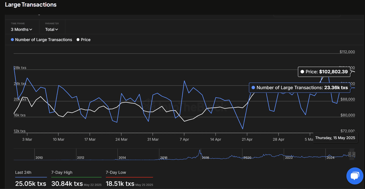
Bitcoin Large Transactions | Source: Intotheblock
It’s not just about the numbers, it’s about the behavior behind them. When whales accumulate, it reduces the supply of Bitcoin or other tokens available for sale. This creates upward price pressure, especially when combined with other bullish indicators, such as declining exchange reserves or rising on-chain activity.
Where to Find Whale Data:
To spot this kind of market movement early, keep an eye on:
• IntoTheBlock: Provides detailed charts tracking large transactions and wallet movements.
• Glassnode: Offers data on wallet sizes, including those holding 1,000+ BTC.
• CryptoQuant: Monitors exchange flows and large holder ratios to gauge accumulation trends.
• Santiment: Highlights wallet behavior and network participation, offering real-time signals.
By monitoring whale wallet growth and transaction spikes, you can gain valuable insights into market sentiment and position yourself ahead of major price moves. It’s a smart way to combine data with intuition, helping you stay a step ahead in the fast-moving world of crypto.
4. Total Value Locked (TVL) in DeFi
Total Value Locked (TVL) measures the total amount of assets deposited into decentralized finance (DeFi) protocols. Think of it as a snapshot of how much money is being put to work in DeFi, whether it’s locked into lending platforms, liquidity pools, or staking protocols.
A rising TVL indicates that more investors are committing funds to these platforms, which often reflects growing confidence in both DeFi and the broader crypto market. When TVL increases, it suggests users are willing to lock up their assets, expecting future returns and market appreciation.
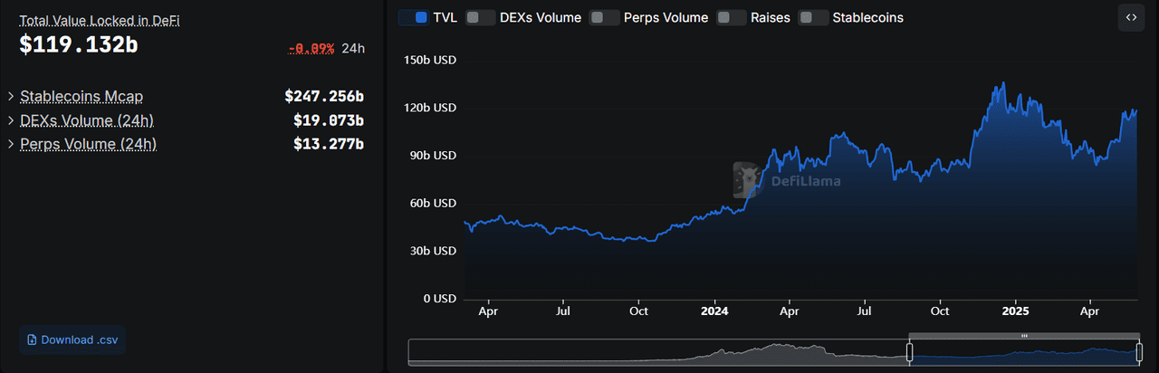
DeFi TVL, May 2025 | Source: DeFillama
For example, the chart from DeFiLlama shows that as of May 2025, the total TVL has climbed to $119.1 billion, up from recent lows of around $90 billion, despite recent market volatility. This is a strong signal that investors are not only staying in the market but are also actively allocating more funds into DeFi, reinforcing long-term confidence.
• More Capital Locked = Reduced Sell Pressure: When users lock assets into DeFi platforms, those tokens aren’t circulating or available for immediate sale. This limits supply, which can drive prices higher if demand increases.
• Growing Confidence in DeFi: Rising TVL suggests users trust DeFi protocols and believe in future growth, even during market dips. This confidence often precedes price recoveries.
• Historical Precedents: Past market cycles have shown that periods of rising Total Value Locked (TVL) tend to coincide with the early stages of bull markets.
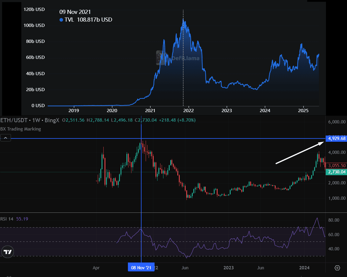
Ethereum TVL (Defillama) & ETH/USD Chart (BingX)
In this example, as TVL surged to over $100 billion in late 2021, Ethereum’s price also soared to nearly $5,000. This simultaneous increase suggests that as more funds entered DeFi platforms, confidence in the broader crypto market grew, contributing to a price rally.
Where to Track TVL Data
• DefiLlama: Offers detailed, up-to-date charts of TVL across various DeFi platforms and blockchains.
• Dune Analytics: Provides customizable dashboards to track specific DeFi protocols and trends.
• IntoTheBlock: Supplies TVL data alongside broader on-chain metrics for a complete market view.
By keeping an eye on TVL trends, especially during market corrections, you can spot early signs of recovery and position yourself ahead of a potential bull run.
5. Active Addresses: Tracking User Engagement in Crypto
One of the most revealing on-chain indicators is the number of active addresses, the count of unique blockchain addresses involved in transactions over a given period. Think of it as a measure of how many people or wallets are actively using the network.
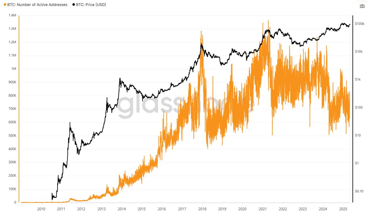
Number of Active Bitcoin Addresses | Source: Glassnode
In the chart above, the orange line represents the number of active Bitcoin addresses, while the black line shows Bitcoin’s price in USD. You can see how these two data points interact over time:
• When active addresses climb, it often signals growing user engagement and confidence in the network.
• Sharp rises in active addresses can precede major price movements, while sudden drops may indicate declining interest or participation.
Why Active Addresses Matter
1. A Proxy for User Interest: When more addresses are active, it typically indicates that more people are using the network to send, receive, or trade assets. This rising participation often correlates with bullish market sentiment.
2. A Reliable Early Signal: Historically, a gradual or steady increase in active addresses, even during market downturns, has signaled that the worst may be over. For example, after the 2017 bull market crash, Bitcoin’s active addresses started climbing long before prices fully recovered, hinting at renewed engagement and a potential market bottom.
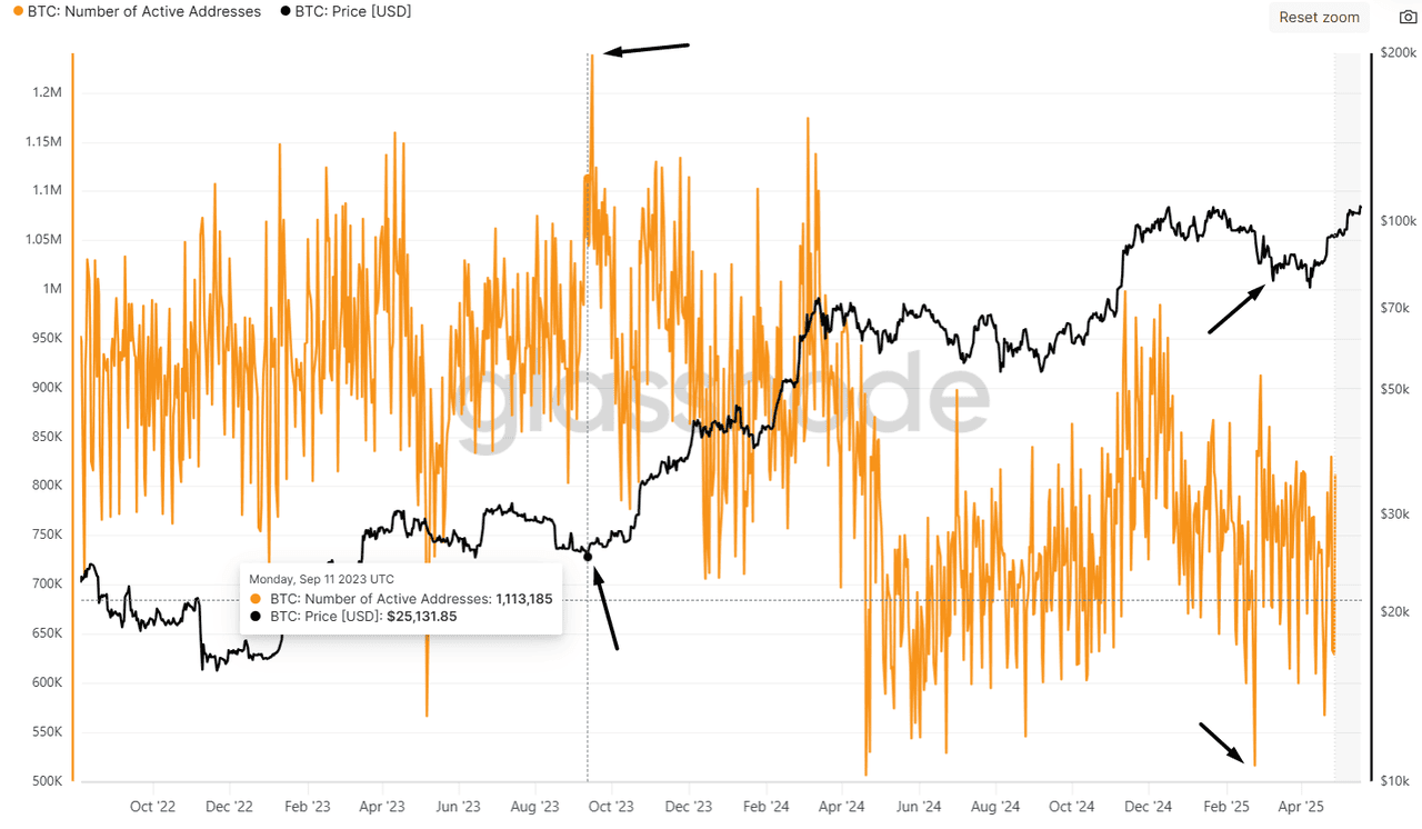
Number of Active Bitcoin Addresses | Source: Glassnode
For instance, the chart shows that, during price pullbacks, such as those observed in recent years, like 2024–2025, the number of active addresses often holds steady or even starts to rise. This suggests that as prices fall, more participants become active, either accumulating assets or positioning themselves for a potential recovery.
This behavior reflects growing engagement during downturns, which can foreshadow a market reversal and renewed bullish momentum.
How Active Addresses Signal a Bullish Market
1. Rising Participation: The increased number of active addresses means more users are engaging with blockchain, laying a strong foundation for future price growth.
2. Network Effect: As more people use the network, its utility and perceived value increase, which often translates into higher asset prices.
3. Market Resilience: Even in downturns, stable or rising active addresses suggest that users are holding firm or accumulating, potentially marking the early stages of a recovery.
Where to Track Active Address Data
• Glassnode: Offers detailed metrics on active addresses for Bitcoin and other major blockchains.
• CoinMetrics: Provides a variety of blockchain activity data, including active addresses.
• IntoTheBlock: Tracks active address trends alongside price and other on-chain indicators.
Combining the On-Chain Data: A Clearer Picture of the Market
Each on-chain metric, whether it’s the MVRV Z-Score, futures open interest, whale accumulation, total value locked in DeFi, or active addresses, offers a unique lens into market behavior. By combining these data points, you can build a comprehensive view of the market’s underlying strength and sentiment.
For example, rising whale accumulation and stable active addresses during price dips suggest that major players and long-term holders are confident, even when prices are falling.
At the same time, increasing open interest and growing DeFi TVL highlight the role of institutions and retail investors fueling the ecosystem.
Tracking these indicators step by step doesn’t just provide isolated signals; it weaves a narrative of capital flow, user engagement, and confidence in the network.
Together, they form a foundation that can foreshadow the next crypto bull run. However, while on-chain data reveals what’s happening behind the scenes, it’s equally important to watch the price charts and technical signals that reflect market behavior on the surface.
From On-Chain Metrics to Technical Indicators Signals
While on-chain metrics provide deep insights into market fundamentals, technical analysis translates this underlying activity into visual price action and chart patterns.
Let’s now shift focus to the technical indicators that can help traders time their entries and exits during a crypto bull run.
1. 50-Day and 200-Day Moving Averages (Golden Cross)
A simple yet powerful tool for spotting potential bull markets in crypto trading is the Golden Cross. This signal happens when the 50-day moving average (MA) crosses above the 200-day moving average (MA) on a price chart.
Here’s why it matters:
• The 50-day MA shows the average price of an asset, like BTC, over the last 50 days, reflecting short-term momentum.
• The 200-day MA averages price over a longer period, revealing the overall market trend.
• When the 50-day MA crosses above the 200-day MA, it suggests growing upward momentum, often signaling the beginning of a bull market.
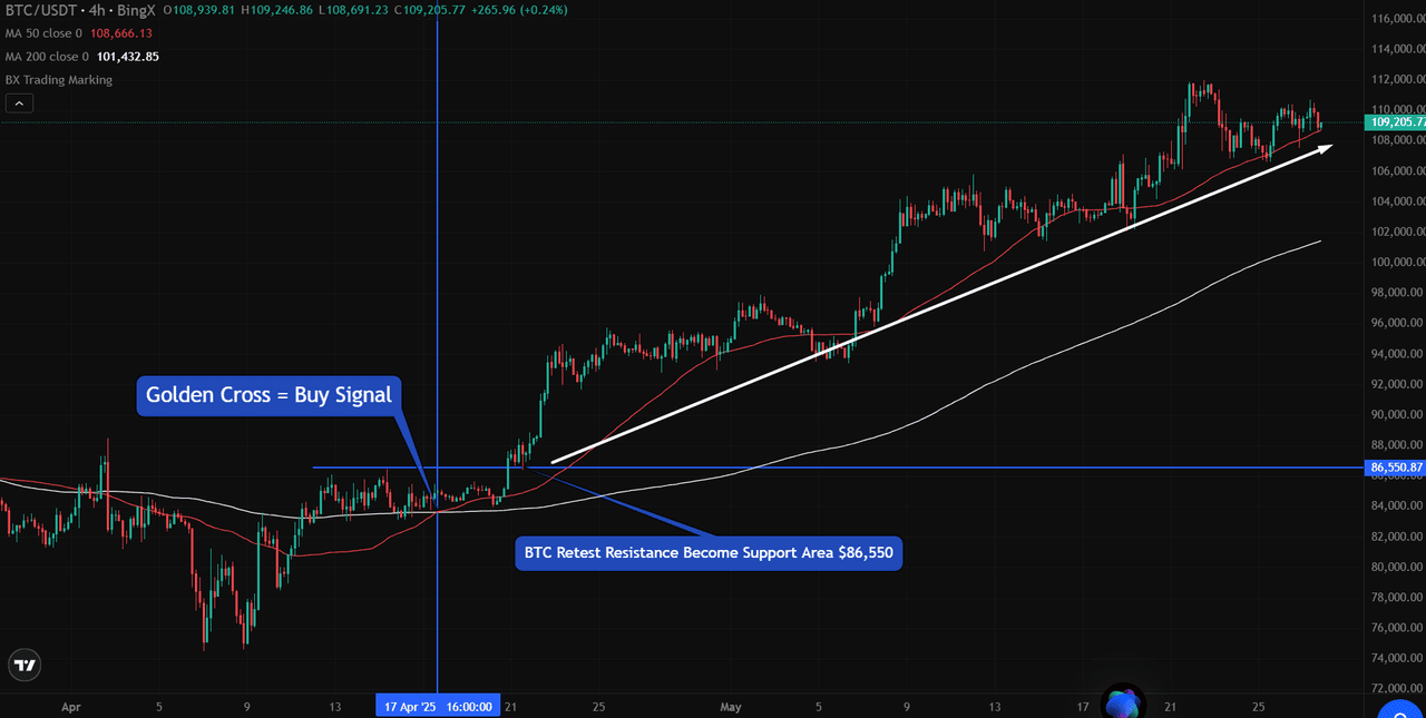
Source: BTC/USDT Trading Chart on BingX
Let’s look at an example from BTC/USDT on BingX. On April 17, 2025, BTC formed a Golden Cross, where the 50-day MA (red line) crossed above the 200-day MA (white line) around $86,550.
Following this signal, BTC confirmed support above the old resistance and rallied higher, marking the start of a strong upward trend.
This crossover is easy to spot by simply adding the two moving averages to your chart. You can see when price action and trend momentum are aligning for a potential bull run.
2. Relative Strength Index (RSI) and Risk Appetite
The Relative Strength Index (RSI) is a momentum indicator that measures the speed and strength of price movements, ranging from 0 to 100. An RSI above 70 often points to overbought conditions, while below 30 suggests oversold levels. However, relying solely on these thresholds can be misleading.
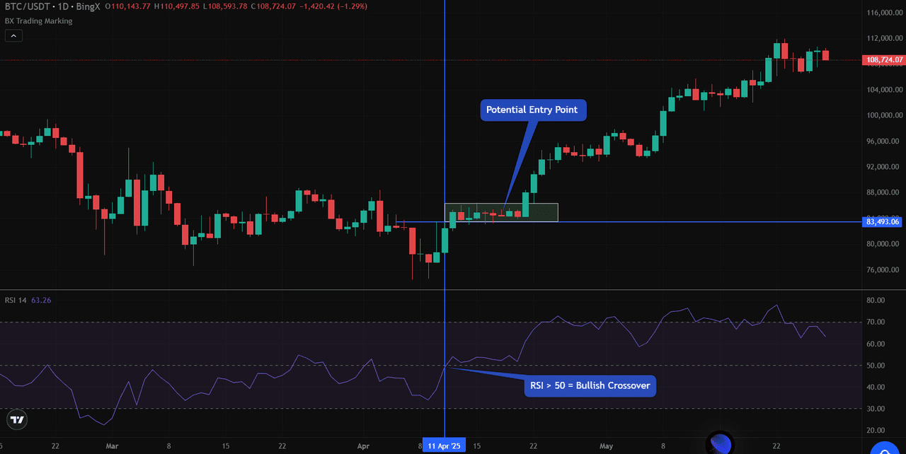
Source: BTC/USDT Trading Chart on BingX
In the BTC/USDT chart from April to May 2025, RSI crossed above the 50 mark on April 11, shifting momentum from neutral to bullish. This occurred alongside price consolidation around $83,493, signaling possible accumulation. Observing this setup allowed traders to anticipate a breakout before the price began to climb steadily.
High RSI values, especially when accompanied by rising volumes, often indicate a growing risk appetite and can signal the early stages of a market rally.
Key points for traders:
• RSI crossing 50 indicates strengthening bullish momentum.
• Sustained high RSI with rising volume can confirm market confidence.
• Divergence between price and the RSI may signal weakening trends.
By combining RSI with price action and volume, traders can more effectively identify market shifts and manage risk.
3. Volume Indicator: Gauging Market Strength
Volume measures the number of assets traded during a given period, providing insight into market participation and conviction. In crypto markets, a rising price alone doesn’t confirm a trend's strength. Volume provides context. When prices rise on substantial volume, it signals that the move is backed by genuine buying interest, not just speculation.
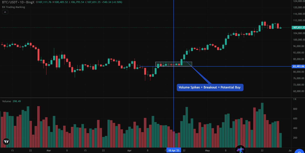
Volume Indicator | Source: BTC/USDT Trading Chart on BingX
In the BTC/USDT chart from April to May 2025, Bitcoin’s price consolidated around $83,493. Volume remained steady during this phase, indicating that the balance between buyers and sellers was maintained. On April 22, a noticeable spike in volume accompanied a breakout above the consolidation zone. This combination, marked by rising volume and a breakout, indicated a shift in market conviction and signaled the early stages of bullish momentum. Traders observing this setup could anticipate the start of a sustained upward trend.
Key takeaways for spotting bullish trends using volume:
• Volume spikes during breakout levels signal genuine market interest and can mark the start of a bull trend.
• Low volume on upward moves may indicate weak participation and a higher chance of a reversal.
• Volume patterns, paired with price action (such as consolidations or resistance breakouts), help confirm trend strength and provide clearer trade setups.
By combining volume analysis with other indicators like RSI and price structure, traders can better identify when a market shift from consolidation to a bull trend is taking place and enter trades with higher confidence.
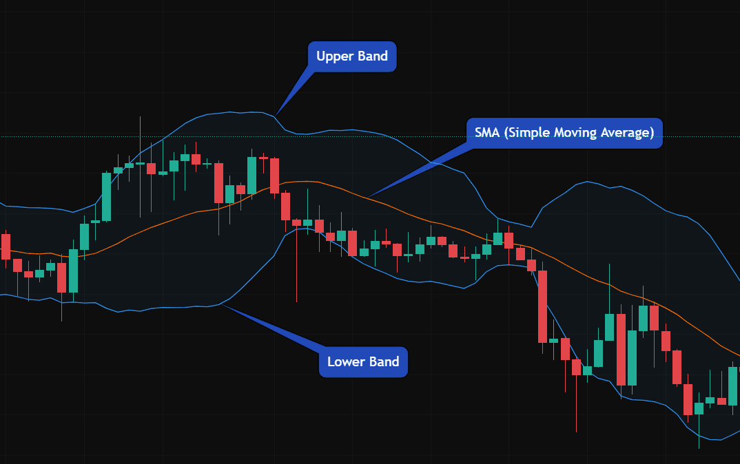
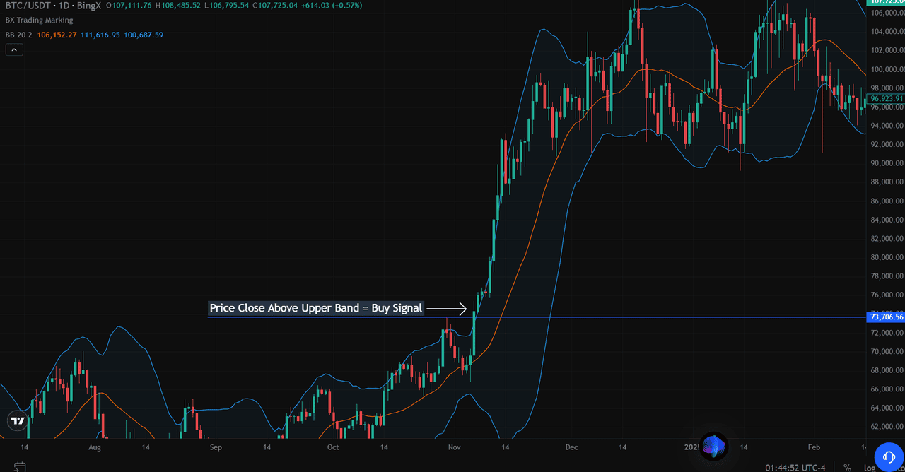
4. Bollinger Bands: Spotting the Start of a Bull Trend
Bollinger Bands, created by John Bollinger in the 1980s, are one of the most popular technical indicators in cryptocurrency trading, as they help identify overbought or oversold conditions. Bollinger Bands is also another great technical indicator to spot early upside trends, and it's made up of three lines:
• The middle band is a simple moving average (SMA) of the price, often set to 20 periods.
• The upper band is typically two standard deviations above the SMA, while the lower band is two standard deviations below it.
• These outer bands expand and contract based on market volatility, forming a “channel” around the price.
Bollinger Bands Indicator | Source: BTC/USDT Trading Chart on BingX
Upper Band and Lower Band Explained
The upper and lower bands create boundaries that contain most of the price action. When the price touches or crosses the upper band, it suggests strong buying momentum. Conversely, touching or crossing the lower band indicates strong selling pressure.
What Is a Squeeze?
A squeeze occurs when the bands contract and come closer together. This tightening of the bands signals a period of low volatility, where the price is “coiling” before making a strong move in either direction.
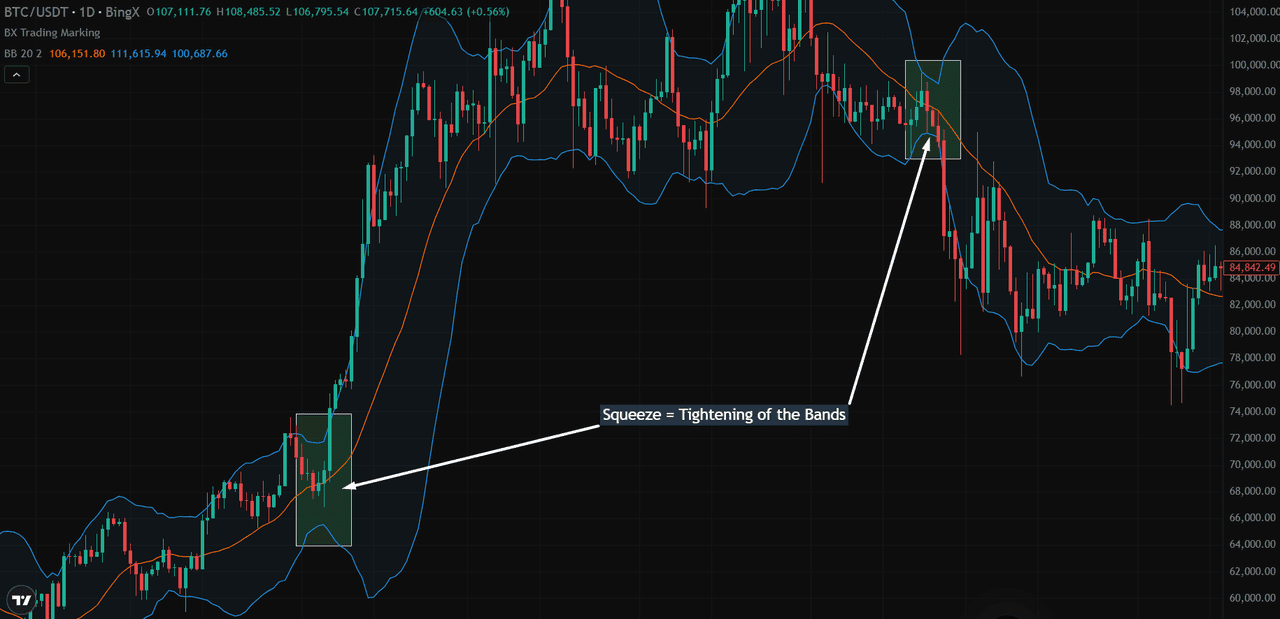
Bollinger Bands Indicator | Source: BTC/USDT Trading Chart on BingX
How to Identify a Bullish Trend with Bollinger Bands:
• Band Squeeze: When the bands tighten, it indicates the market is preparing for a breakout.
• Price Close Above Upper Band: A strong price move that closes above the upper band suggests a surge in buying pressure. This often marks the start of a bullish breakout.
• Squeeze Breakout with Volume: When a breakout is supported by rising trading volume, it signals that more participants are entering the market, thereby increasing the likelihood of a sustained uptrend.
• Trend Confirmation: After the breakout, if the price continues to “ride” the upper band while the bands widen, it confirms the start of a bullish trend.
Bollinger Bands Indicator | Source: BTC/USDT Trading Chart on BingX
In the BTC/USDT example, once the price broke above the upper band, it climbed from around $73,000 to over $107,000, showing clear bullish momentum.
Key Takeaways for Traders
• Watch for band squeezes as early warnings of a breakout.
• A close above the upper band with high volume often signals the start of a bullish move.
• Continued price movement along the upper band, with widening bands, confirms a strong uptrend.
By using Bollinger Bands in conjunction with volume and price action analysis, traders can more effectively identify the onset of a bull trend and position themselves accordingly.
5. Fibonacci Retracement and Extension: Pinpointing Bullish Reversal and Target Zones
Fibonacci retracement and extension levels are powerful tools traders use to identify potential support, resistance, and price targets during bullish and corrective phases. These levels are based on key Fibonacci ratios derived from price movements.
Fibonacci Retracement levels (e.g., 38.2%, 50%, 61.8%) are used to gauge how far a price pullback might go before resuming an uptrend. Fibonacci Extension levels (e.g., 1.0, 1.618) are used to estimate where the price might reach if the trend continues.
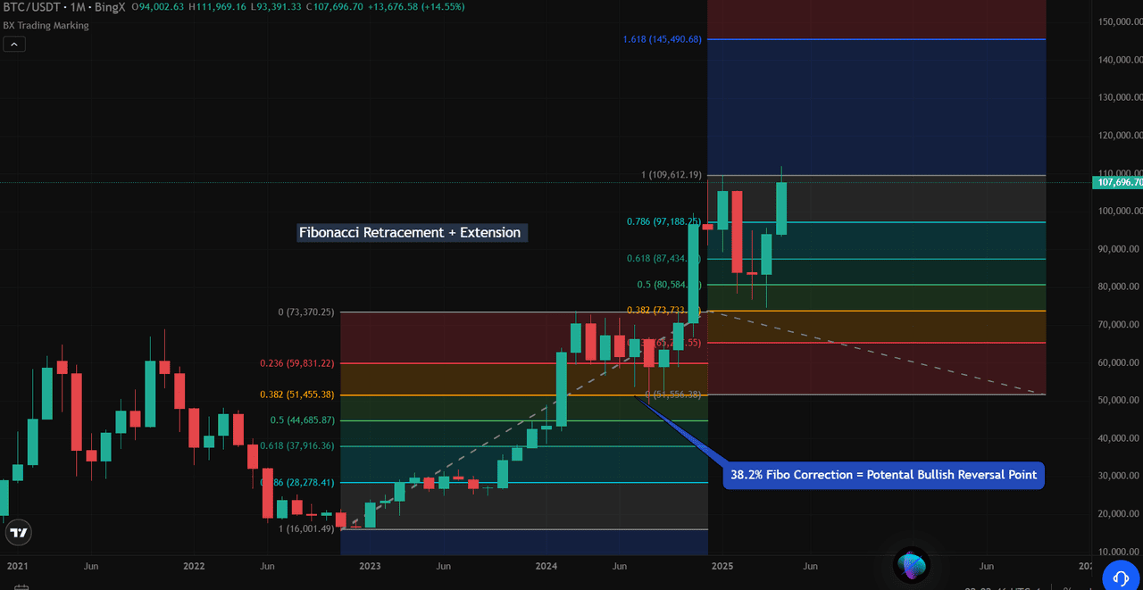
Fibonacci Retracement and Extension Indicator | Source: BTC/USDT Trading Chart on BingX
In the BTC/USDT chart from 2024-2025:
• The retracement is drawn from a key swing low around $16,000 to the swing high near $73,370.
• Key retracement levels include:
- 38.2% at $51,455 – a common pullback point where traders often look for price support.
- 50% at $44,686 and 61.8% at $37,916 – deeper pullback zones with stronger reversal potential.
When BTC’s price corrected, it found support near the 38.2% retracement level, suggesting a potential bullish reversal. This level often acts as a "line in the sand" where buyers step in, as seen historically during recovery phases.
For upward targets, extension levels project where the price might reach if the uptrend resumes:
• 1.0 (100%) extension at $109,612 – a key target where traders may lock in profits or anticipate resistance.
• 1.618 extension at $145,490 would provide the next major resistance if the trend continues strongly.
Key Takeaways for Traders:
• Use retracement levels (38.2%, 50%, 61.8%) to spot potential support during corrections.
• Monitor price reactions at these levels, especially with confirmation of volume.
• Use extension levels (1.0 and 1.618) to project upward targets once the price resumes the uptrend.
• Combining Fibo levels with price action and indicators like Bollinger Bands and RSI enhances accuracy.
Conclusion
By combining on-chain metrics with technical indicators, traders can gain a comprehensive understanding of crypto market dynamics and anticipate bullish trends with greater confidence. On-chain signals, such as rising whale accumulation, stable active addresses, and increasing Total Value Locked (TVL) in DeFi, reflect growing investor engagement and long-term commitment.
These foundational insights, when paired with technical tools like the Golden Cross, RSI momentum shifts, Bollinger Bands breakouts, and Fibonacci retracement and extension levels, help confirm market strength and identify actionable entry points.
This integrated approach not only improves timing and decision-making but also reduces the risk of false signals. In a market as fast-moving and volatile as crypto, combining multiple indicators provides a balanced view of sentiment and price action, giving traders and investors an edge in spotting and riding potential bull runs.
Related Reading
2/2Frequently Asked Questions (FAQs)
Q1: What is the most reliable indicator for predicting a crypto bull run?
There’s no single “most reliable” indicator, but combining multiple signals, such as rising MVRV Z-Score, whale accumulation, and technical patterns like Golden Crosses and Bollinger Band breakouts, provides a stronger case for a potential bull run.
Q2: How early can on-chain data signal an upcoming bull run?
On-chain indicators, such as whale accumulation and an increase in active addresses, can often signal shifts in sentiment before they appear on price charts, giving traders a valuable early edge.
Q3: Why is volume analysis crucial in crypto trading?
Volume confirms the strength of price movements. High volume during a breakout suggests genuine buying interest, while low volume may signal a weaker or false move.
Q4: How does the Golden Cross signal a bull market?
A Golden Cross occurs when the 50-day moving average crosses above the 200-day moving average, indicating that short-term momentum is outpacing the long-term trend, often a bullish signal.
Q5: Can Bollinger Bands predict crypto price breakouts?
Yes. A narrowing of the bands (a squeeze) followed by a breakout above the upper band, especially with rising volume, can indicate the start of a bullish trend.
Q6: What role do Fibonacci levels play in crypto trading?
Fibonacci retracement levels help identify where prices may pull back and find support, while extension levels suggest potential upward targets during a bull run.
Q7: Should I rely only on technical indicators to predict bull markets?
No. Combining technical indicators with on-chain data provides a more comprehensive view of market behavior, enhancing the accuracy of predictions and mitigating risks.